Every business website has (or should have) a Contact page. Is this page doing all it can do for your business – or is it just another one of those pages that you know you should have – so you throw it together and check off that box? If so – you could be missing out on an opportunity to convert site visitors into customers.
I came across this article by Danielle Willatt from Bitcatcha and thought it was worth sharing. She’s rounded up several examples of Contact Pages and walks us through what we should – and shouldn’t be doing with our Contact pages. The examples she shares with us – represent a wide variety of business types and sizes, as online retailers – we can learn from each of these examples.
Contact Us Page Examples: The Good The Bad And The Ugly
Is your website’s contact page scaring people off?
Done right – a contact page can be a source of great leads and game-changing opportunities.
It’s also a page that many website owners neglect. If you’re not optimizing your contact page, you’re quite literally missing out.
Today, we’ll show you the best contact page examples and tips. Whether you’re building a new website, or have had one for years – it’s never too late to improve yours.
Why Contact Us Pages Are Such A Big Damn Deal
A contact page is a must-have for any website.
Your homepage may be your highlight, but your contact page is often where the real magic happens.
It’s where opportunity can come a-knocking. It’s where…
- Media enquiries come in.
- Customers provide feedback.
- Brands reach out with collaborations.
- Potential clients ask about your products / services.
As well as helping you get GREAT leads, a great contact page will help save back-and-forth on emails, and reduce spam.
Contact Us Page Must-Haves
To understand the elements of a GREAT contact page, it’s helpful to look at examples.
We scoured the internet for outstanding contact pages and noticed a few trends among them. They:
- Are very user-friendly.
- Can easily be found on the website.
- Have strong visuals and inviting text.
- Included all important details someone would need.
- Worked to cut spam through a FAQ or by filtering data.
Let’s dive into the examples – I’ve split them into different categories for easy reading.
1. Contact Us Page With Great Design
The design of a contact page should be user-friendly and encourage visitors to contact you.
Here are some well-designed examples.
1.1 Focus Lab
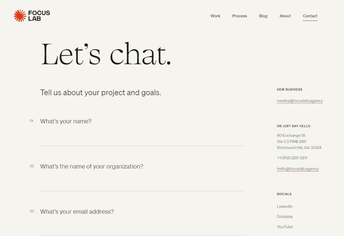
What they do well: Provide an inviting ‘fill in the gaps’ format.
This agency’s contact page gets its visitors to answer certain questions by typing in the blank spaces. This works well for a few reasons.
Firstly, it looks inviting. Secondly, it ensures that they’ll get all the important information they need from a client in the very first message.
By asking upfront about an estimated budget and timeline, you won’t need to waste time with back-and-forth emails. You’ll be able to judge how serious a client is and can prioritize replying to the ones with the most potential.
1.2 Nuud
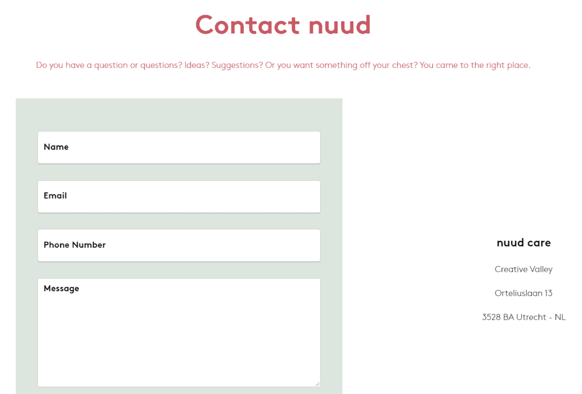
What they do well: Keep things minimalist.
Often, simple is best. A basic layout with no distractions makes it easy for users to submit their message.
Eco-deodorant brand Nuud keeps their contact page very minimalist. A simple form collects important data, and lets visitors type their queries into a text box.
Note
The easiest way to build a simple contact page is via a website builder like Zyro that has a dedicated ‘Contact Form’ element that you can drag and drop onto your site. Alternatively, WordPress has some great contact form plugins.
1.3 Yeti
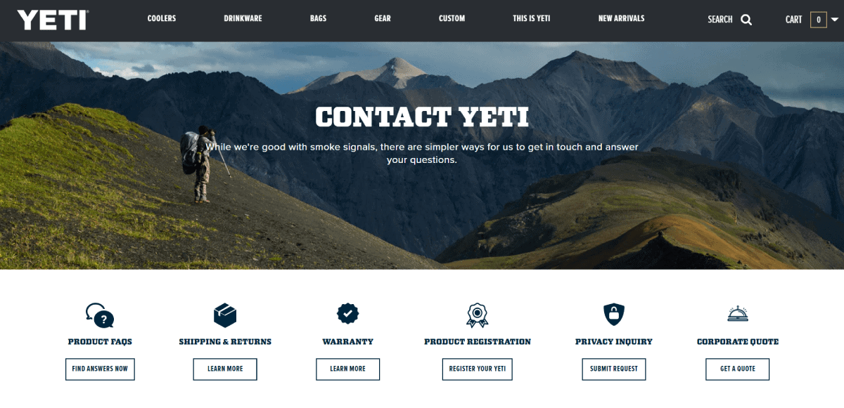
What they do well: Eye-catching visuals and clear categories.
Yeti’s contact page starts with a striking header image that gets the brand’s outdoors-y message across in seconds.
In order to cut down on receiving repetitive questions from visitors, Yeti also offers up resources such as product FAQs and shipping information. Each is displayed on the page with a clear logo.
If a visitor still can’t find the answer they’re looking for, they can scroll down to get in touch via email.
1.4 McDonald’s
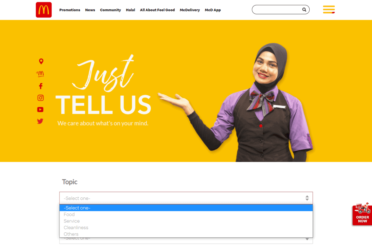
What they do well: Friendly visuals.
First impressions are always important. That’s why McDonald’s went out of its way to show a smiling manager with the iconic golden yellow that the brand is well known for.
It’s inviting and friendly. From there, you can also categorize your inquiry as food-related, service-related, etc.
1.5 Jayne May Agnes
What she does well: Asks the important questions.
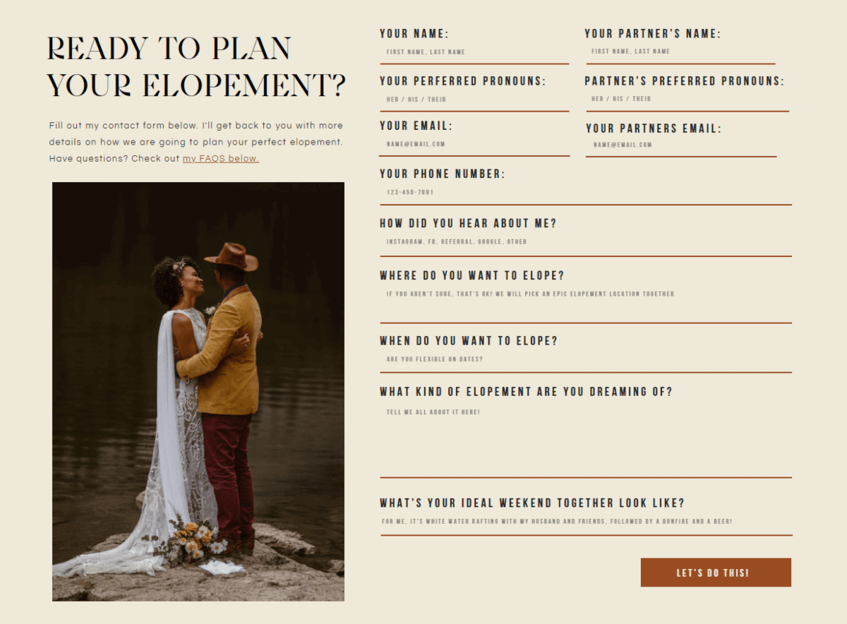
Here’s another example of a contact form that will save you lots of back and forth.
Anyone getting in touch with this freelance photographer will need to answer key questions, such as what their dream elopement is, and how they came to know of the photographer.
You even need to fill in your partner’s details. This sort of form should be enough to filter out anyone who isn’t serious about engaging the freelancer’s services.
2. Contact Us Page With Great Writing
Strong content writing can transform a contact page beyond a boring form. Here’re some examples of contact pages with great writing.
2.1 Nebular Agency
What they do well: Punchy writing.
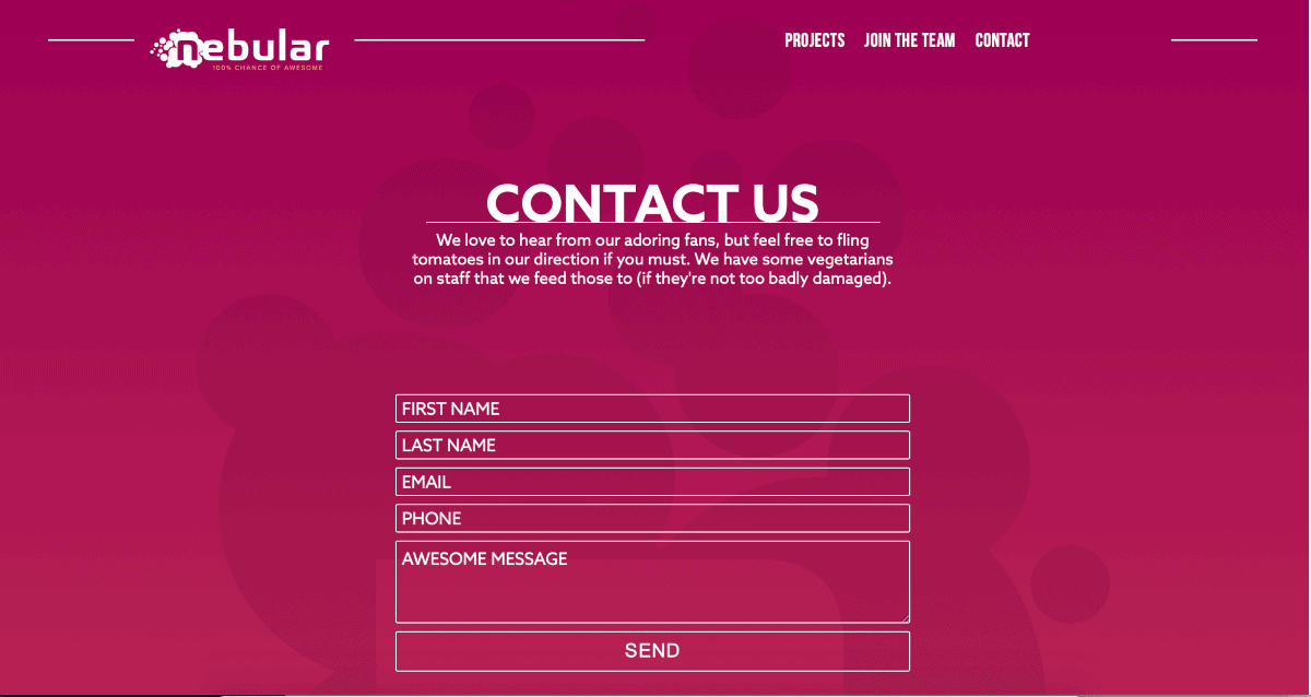
Nebular’s contact page is quite minimalist in terms of format: a simple and effective form.
However, their little paragraph under the ‘Contact Us’ banner is charming, and welcomes both positive and negative feedback. Users simply need to drop their details, and type their ‘awesome message’ into the textbox.
2.2 Middle Finger Project
What they do well: Tongue-in-cheek writing.
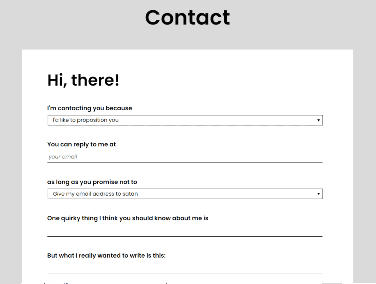
These guys have one of the most unusual contact pages around. In fact, it’s almost kind of irresistible to fill in.
It has a few drop down menus that you need to pick from before you can type in your message.
Each has some wacky and pretty funny options – for example, you can ask them to promise not to ‘give your email address to satan’. You’ll even need to pick a sign-off, from ‘XOXO’ and ‘High Five’, to ‘Irish Jig,’
2.3 David Folger Young
What he does well: Cuts all the crap.
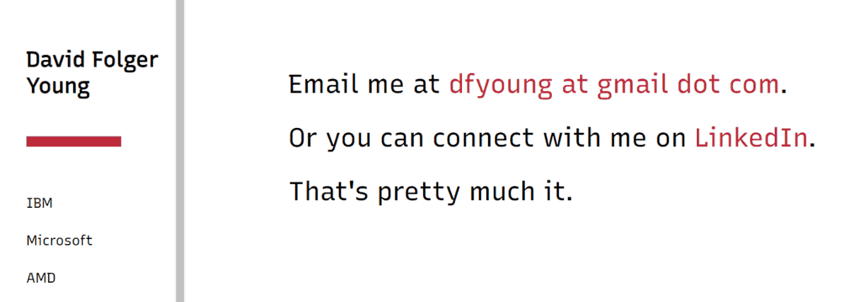
This copywriting portfolio’s contact page perhaps contradicts the other examples in this article, but I can’t help but like it anyway. It gives you an idea of another direction you can take.
It displays an economy of words in the true ways of the copywriter, and is somehow more refreshing than something boring and corporate. It goes to show a contact page doesn’t always need to be fancy – it just needs to exist.
2.4 Valve
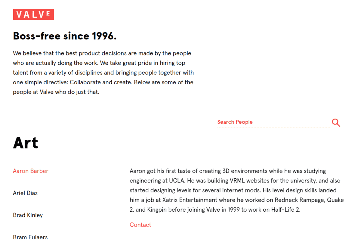
What they do well: Humanise their contact team.
Video game developer Valve’s main strength is the individual talents of their team. And their contact page reflects this.
You actually can see a list of their staff names and descriptions. If you want to send a message, the page will display their individual names – e.g.: ‘You’re Emailing Fred Fredderson’.
It lends such a nice personal touch to the whole thing and reminds you that you’re contacting a real human.
3. Contact Us Page With Clever Usability
Here are some examples of contact pages that have been cleverly put together.
3.1 Grant Thornton
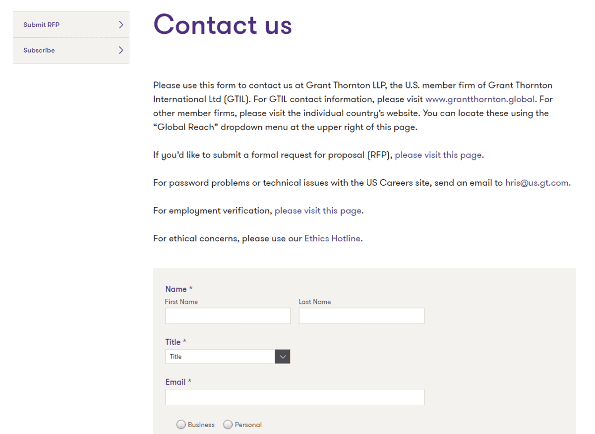
What they do well: Filtering recipients.
Accounting and advisory company Grant Thornton’s contact page is tailored to their audience of working professionals.
When submitting the message, you’ll need to select your specific professional title from a dropdown menu. Whether you’re a chairman or CEO – they’ll know exactly who they’re talking to. No doubt, this can help them prioritize responses.
3.2 Accenture
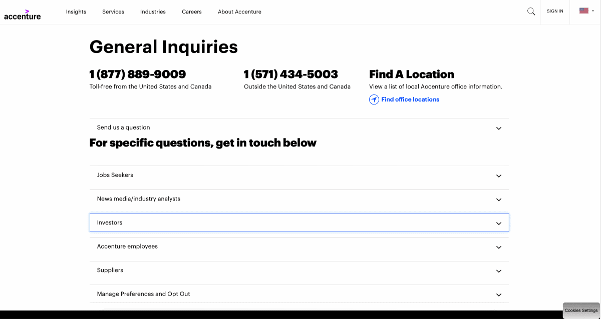
What they do well: Keep things compact.
Accenture uses a handy list format that expands downwards to reveal more information on how to get in touch. Each is targeted at a certain type of stakeholder – e.g. suppliers, or job seekers.
This helps provide a cleaner interface for the user, since you’ll only need to click on the sections that are relevant to you.
3.3 WeWork
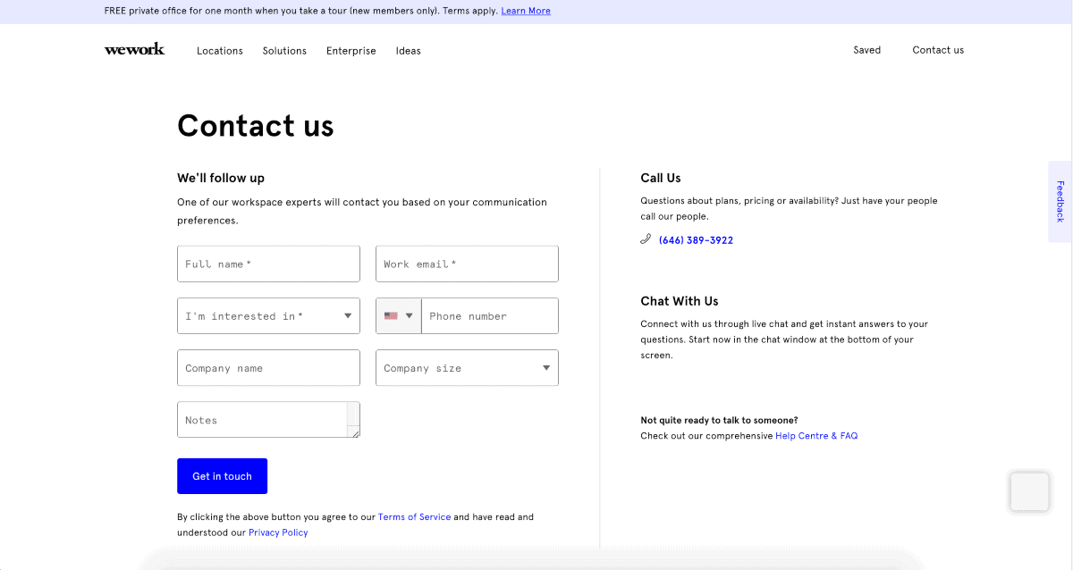
What they do well: Offer a whole range of contact methods.
WeWork lets users clearly see all the different methods to get in touch with them – whether it’s by the online form, by telephone, live chat, or by visiting the help centre.
Their drop-down menu lets you specify what you’re interested in (e.g. ‘finding a workspace’), and the size of your company.
Combined, this contact page should offer a solution for EVERY visitor wanting to get in touch.
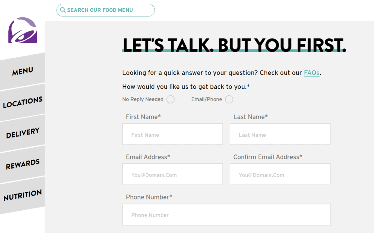
3.4 Taco Bell
What they do well: Asking people how they want to be responded to.
There are a few things we like about Taco Bell’s contact page. For example – the heading is catchy, and you can easily leave feedback about specific restaurants (and even specify the address of the outlet).
But the best? It asks visitors to specify if they even want a response. By clicking ‘No Reply Needed’, visitors can clearly indicate whether they are expecting a response from you.
4. Contact Us Page With FAQs
Many website owners receive emails from customers all asking the same questions.
Putting together a Frequently Asked Questions (FAQ) section can be a helpful way to cut down on repetitive messages.
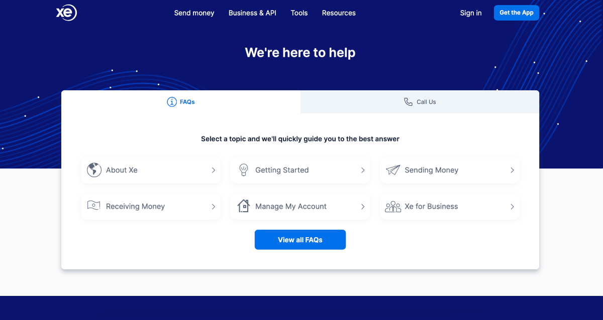
4.1 XE
What they do well: Great FAQ at the top of the page.
Currency converter XE has a nice looking FAQ that’s separated into different categories, rather like a knowledge-base. This FAQ is put at the start of the contact section so users can easily skim through to find answers.
If they still have a query, they can then get in touch by switching to the secondary tab on the website.
5. Contact Us Page Needs To Be Mobile Friendly
More and more people are browsing the internet via a mobile device. Google also favours mobile-friendly websites and uses it as a ranking factor for searches.
So it’s incredibly important that ALL pages in your site are mobile-friendly.
For a contact page, this can involve:
- Simplifying navigation.
- Keeping copy short and sweet.
- Making sure your buttons and form fields are big enough.
If you’re using a website builder to build your site, it’s essential you choose one that lets you control exactly how your site looks on any device (like these website builders that we’ve put to the test).
Alternatively, if you’ve already set up your website with WordPress – consider using a plugin like Elementor which has advanced ‘mobile responsive editing’ features.
Here are 2 examples of great contact page examples that are mobile-friendly.
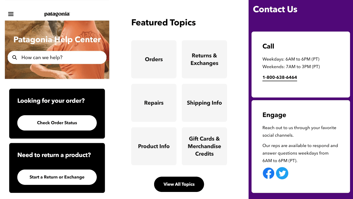
5.1 Patagonia
If your site has a lot of information, it can be especially hard to adapt it into mobile format.
Clothing brand Patagonia does this really well by including a search bar that helps users navigate this part of the website.
The rest of the contact page has been adapted for mobile viewing. Text is large and separated into clear sections that can be scrolled through. CTA buttons are large and easy to press with thumbs. No zooming is required.
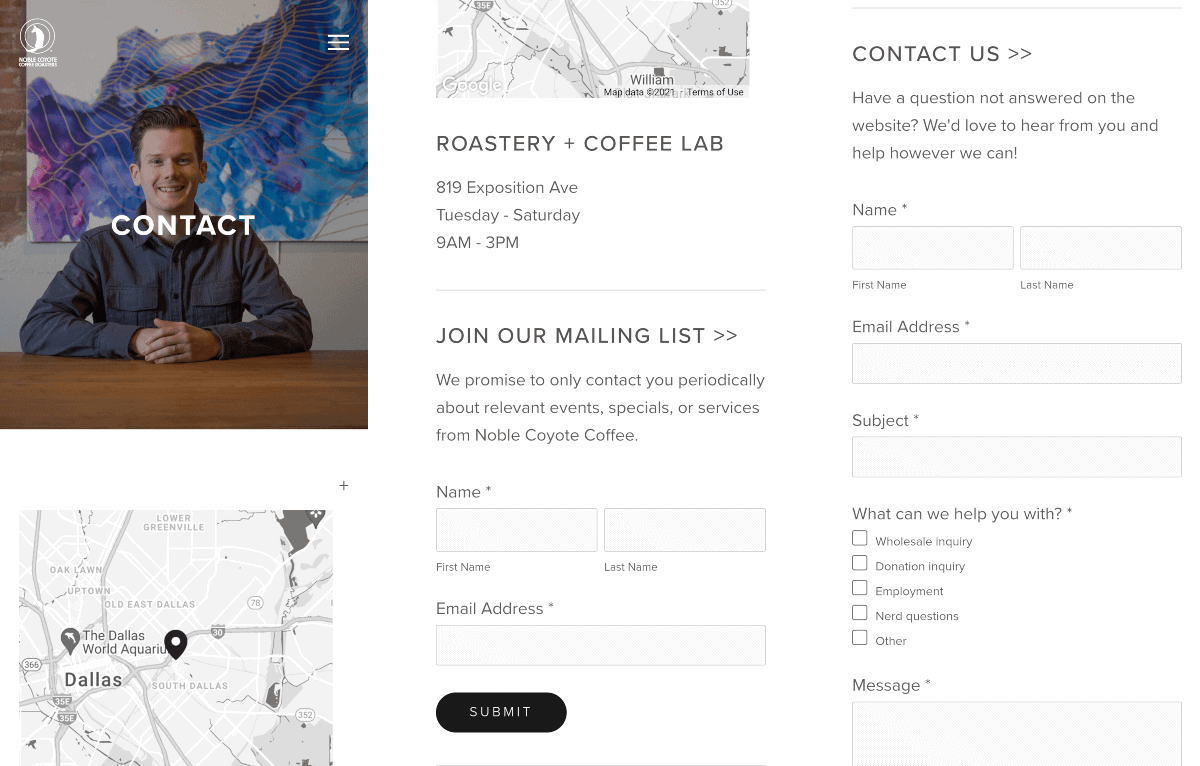
5.2 Noble Coyote Coffee
This Dallas based cafe made all parts of their contact page responsive.
Because the form fields are large, people can easily fill them in on their phones. They also include a Google Maps integration – tapping on the map will allow you to get driving directions to their outlet.
What Not To Do On A Contact Page
Avoid making these key mistakes on your contact page, as you can risk losing the attention and trust of visitors:
1. Don’t use poor grammar
Unironically poorly-written copy can affect your rankings. And, most obviously, your credibility.
Keep your copy simple, comprehensive, and friendly to the average visitor. It can help to use a good grammar checker.
2. Don’t make it hard to read
Don’t make your contact page hard to look at! Some big no-nos that we often see:
- Pages that load slowly (check with our website speed test).
- Text being hard to read on a background.
- Overloading
boringgeneric stock images.
Remember, your contact page reflects on your website branding. Do it justice!
3. Don’t bury important information
Your job is to make it easy for great leads to find you. So don’t throw obstacles in their path.
For example – the below example contact page asks people to send an email to their gmail account, without providing the actual email address.
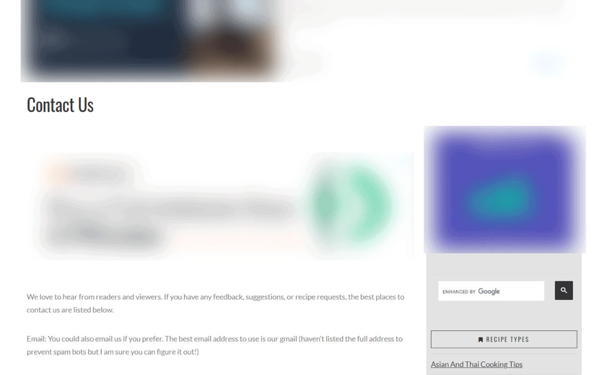
Asking your readers to guess your email address is probably not going to end well.
Wrap Up
A great contact page can take you a long way. We hope this article has inspired you to take a second look at yours.
Remember, your contact page should be one of the most user-friendly pages on your website. But it’s also a place to show off your brand, and encourage the RIGHT types of messages.

